A few days back, I saw an interesting political advertisement near my home and I wondered about the entire ad design process that resulted in this visual and politically stimulating masterpiece.
The Customer Need
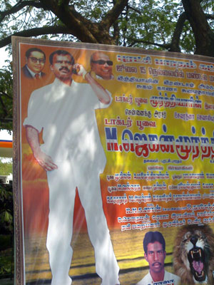
The customer is a young man, by political standards. Fortyish perhaps. Rising fast through the ranks. Son of a political martyr who died in an anti-dalit riot in the 70s. This is a bit of red letter day for him. It is the first time that he will headline a poster for his party. For the uninitiated, political posters in India usually feature an average of 80 people’s photos crammed into a single frame with photo sizes relative to their poltical clout. There is also a standard header featuring famous dead people associated with the party. (In some cases, famous images are adopted regardless of the dead soul’s actual involvement in the party). He meets the creative director of Velmurugan Arts, who is one of few political ad agencies who have successfully made the shift from the hand painted posters of yore to the questionably kitschy photoshopped monstrosities of today. Our upcoming revolutionary leader has a few simple requirements for his debut headline poster.
- I need to be seen as being confident and stylish
- I need to be seen as being an excellent communicator
The creative design process
Velmurugan has already designed 3/4ths of the poster. A bold golden sunrise, Ambedkar with pink lipstick and a roaring lion are already part of this magnum opus. He contemplates on our customer’s needs and chalks a mental plan of how he plans to fill the rest of the 1/4th of the poster. He ponders. Stylish = white and white. Confidence = one hand in pocket. Good Communicator = cellphone in other hand. The resultant masterpiece is ready. And here it is:

Leave a reply to Ashok Cancel reply