Yahoo! recently spent a lot of money on a new logo. In fact, they tried new logos for 30 days before settling on one that looked like a bar of Cadbury’s Dairy milk.


But when I look at the 30 that were rejected in favour of this one, it seems to me that they really didn’t expand their horizons. There are rarefied hill stations of Logo design philosophy that they most definitely did not visit. For instance, did they consider the new Apple iOS7 logo design school of thought?

The iOS7 school promotes
- Anorexically thin fonts, ones that require electron microscopes to measure thickness
- Colour gradients that are inspired by hallucinogenic highs
If not iOS7, what about the legendary 2005 school of Microsoft Packaging?

Microsoft (at least in the past) believed in a branding philosophy that was quite similar to their approach to software design in things like MS Word. Why focus on the few important features when everything could be shoved into the face of the user through the cunning use of ribbon menus that are designed to make users forget where MS hid the feature they really want to use right now.
But these design options are for amateurs. Let’s now see some truly disruptive logo design philosophies of our time.
More people in the world experience this particular cutting edge design philosophy on a day to day basis than anything else. It is cutting edge because it truly cuts the edge of every blade server that powers corporate email platforms. It’s called
The HR Department Style
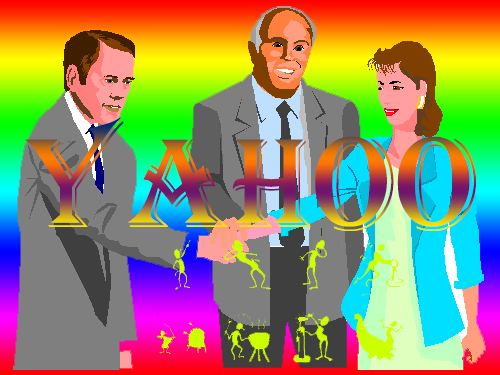
The Epicurean HR Department School of Graphic Design works this way
- That shalt have no gods other than Microsoft Powerpoint.
- Thou shalt use vibrant clipart from the artistic rainforest that was the MS Office 97 Clipart Gallery
- In keeping with the company’s diversity and inclusion values, colours that do not mix shall be made to mix in the gradients that will mandatorily be used as the background
- Try out all fonts first but eventually choose between Algerian, Comic Sans and Monotype Corsiva
If this didn’t work for Yahoo, I don’t know what will.
Perhaps the Indian Engineering College Techno-management Fest school of Graphic Design?

The rules are quite simple
- Imagine you were ultimately going to make a Flash animation out of the logo.
- Use a computer generated space scene type background featuring whirling nebulas, supernova explosions and planetary silhouettes all next to each other for no good reason
- Pick a sci-fiesque font like Coalition
- Add an outer glow to the main text
- Add something like “Transcending Boundaries” or “Inspiring Innovation” or “Dividing the numerator of ordinariness by zero” at the bottom.
- Don’t forget to mention if it’s “international level” or “national level” and use hyphenated words like Techno-management, Manago-scientological or Syngergo-Value-Engineeringo-techno-functional
But perhaps Yahoo! is looking for something more. Something beyond what these bleeding edge design philosophies offer. Something that blends the best of these schools into one world beating logo design philosophy that the world outside India has rarely experienced.
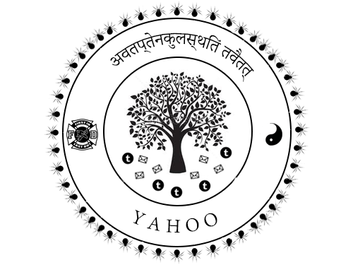
The Indian Government School of Logo Design.
Let’s first see some classic examples from this school

Now let’s apply this design philosophy to Yahoo’s logo
We start, as we always do, with concentric circles. These symbolize the circuitous journey a citizen often has to take when dealing with the government in general.

Now we need something from the animal kingdom that symbolizes what Yahoo is about. I think spiders (weaving the web etc) will work well. Let’s add spiders all around the outer concentric circle

From the animal kingdom, we must be fair and balanced and move on to some flora. Yahoo! is about the web of knowledge and nothing symbolizes knowledge better than a tree, so we add a tree right in the center
But this is the Indian Government School of Logo Design, and here, we believe in the “Let’s cram the entire Mahabharatha of symbolism into every logo” motto. This means that the tree of knowledge has to necessarily drop some leaves and fruit. For Yahoo, their tree will drop spam emails and Tumblr blogs.

And then we get to Typography. The rules are simple.
- Pick a random Sanskrit quote. It doesn’t matter what it means. Like white people and Chinese tattoos, Sanskrit mottos just have to sound cool without necessarily meaning anything profound For Yahoo! we have picked अवतप्तेनकुलस्थितं तवैतत् which means “Acting like a Mongoose on hot ground”. I feel that this quote is an excellent replacement for the terpischorean jollity of the exclamation point at the end of the word “Yahoo”
- The text should follow the path of the circles so that they are not that easy to read

The final step involves looking at the logo long and hard and finding out if any space has been left out untouched by the wise hand of our graphic design. My eyes immediately fell on the space between the concentric circles at 0 degrees and 180 degrees. What do we fill it with though? In India, we always respect our elders no matter how irrelevant they eventually become, so for Yahoo! we will pick their founders David Filo and Jerry Yang.
- Filo will be represented by the “First In Last Out” motto of the Fire Department
- Yang will be represented by one half of that ridiculously overused Chinese symbol of new age philosophy
And we have our final product

Leave a comment